George Mason University uses a system called eSuds to control the laundry machine transactions in the dorms. What makes eSuds really cool though, is that it keeps track of the status of every machine and displays it on a website so students can check how full the machines are before making the trek down to the laundry rooms. The system emails each student when their laundry is finished as well.
The only problem is that their user interface is pretty atrocious. I wrote up a usability analysis of the site for my SWE 205: Software Usability Analysis and Design class, but most people agree it’s a pretty painful interface to use (just see for yourself). The thing is, most of the information that’s on the website could be reduced to a few charts. I’m a big fan of simplifying data, so I thought: why not?
I decided to create the visualizations with pygal, because the charts it spits out are absolutely gorgeous and well… it’s in python, which made it easy for me to dive right in. I’ll probably try out d3js for my next visualization project though, it looks a whole lot more advanced.
Current laundry usage charts
I created an app in Django to display current laundry machine usage charts for all of the laundry rooms on George Mason’s campus. All of the data is scraped from the eSuds site using Beautiful Soup and updated every time you refresh the page.
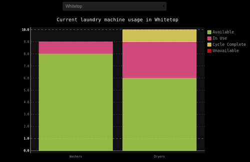
The site will save which laundry room you select so when you come back you will immediately see the chart for your laundry room.
You can see the code for this on my GitHub (look in the “laundry” folder).
The point was to make this as dead simple and easy to use as possible. Do you think I succeeded?
Weekly laundry usage chart
Knowing the current laundry machine usage is nice for saving a wasted trip down to the laundry room, but what if you wanted to plan ahead and do your laundry when you know other people are less likely to do laundry? That’s why I recorded the laundry usage with a cronjob every 15 minutes for an entire week: to get an idea of when there is a high probability of open machines.
This one is a little interactive.
As you can see, the laundry usage jumps around all over the place very quickly. This definitely provides evidence to some previous frustrations I’ve had when I had checked eSuds, saw that most machines were open, and arrived in the laundry room to suddenly find that no machines were open.
So when is the best time to do laundry?
After analyzing the data for a bit, I noticed that there still seemed to be quite a bit of usage around midnight and 1 AM, which, I suppose, would be expected of college students. However, after about 2 AM the laundry usage consistently teeters off until about 10 AM. So I guess there’s no way around it; if you want to have the laundry room to yourself, you’ll have to be the early bird.
Also, I should note that this was during the week of spring break. I’m currently working on recording data over a few normal weeks and then compiling it into one average week in order to see the patterns more clearly. I’ll post again once I’ve done that.
This was a lot of fun and I expect to make more data visualizations in the future.
Let me know what you think!
EDIT: Check out the comments on Reddit.
Subscribe to my future posts
